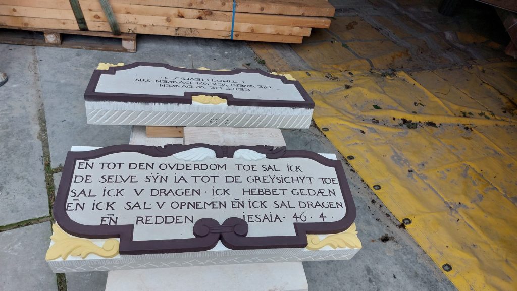
• Five gable stones for Zeeland widows

    Five Biblical texts

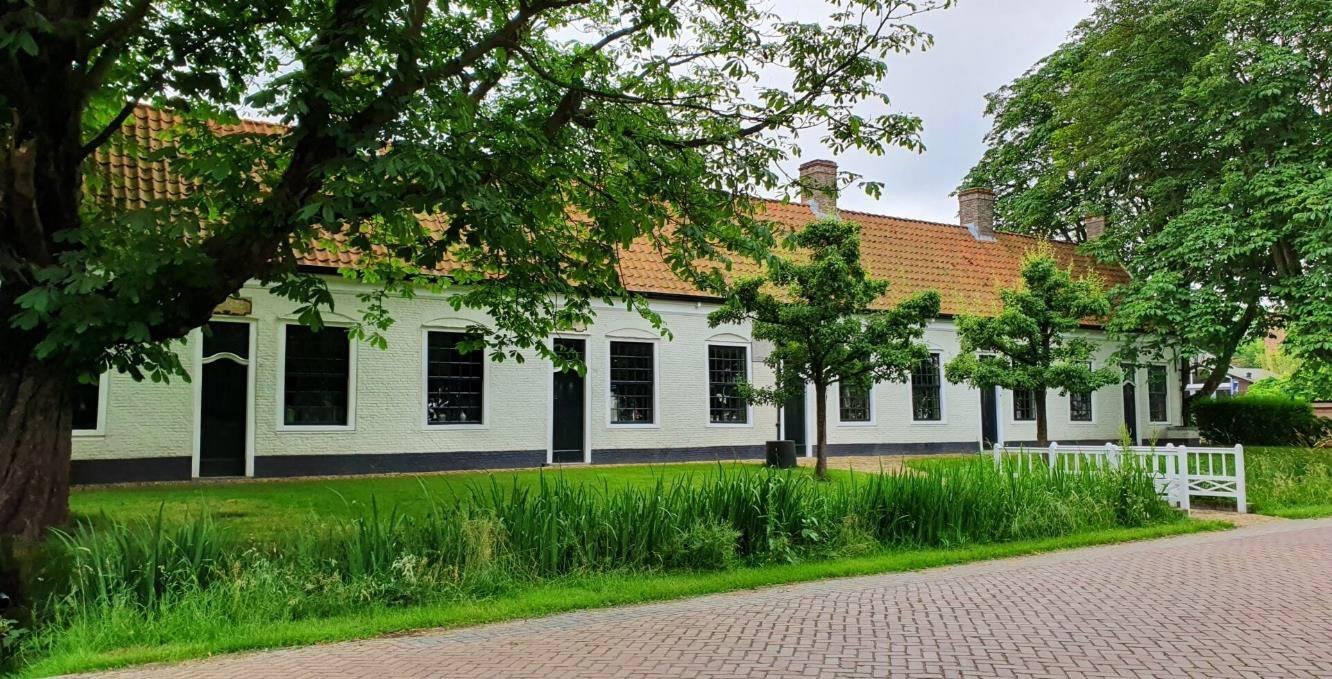
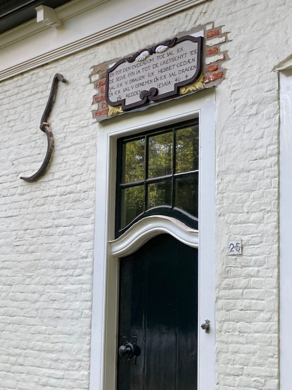
    The five Conyers houses in Noordgouwe
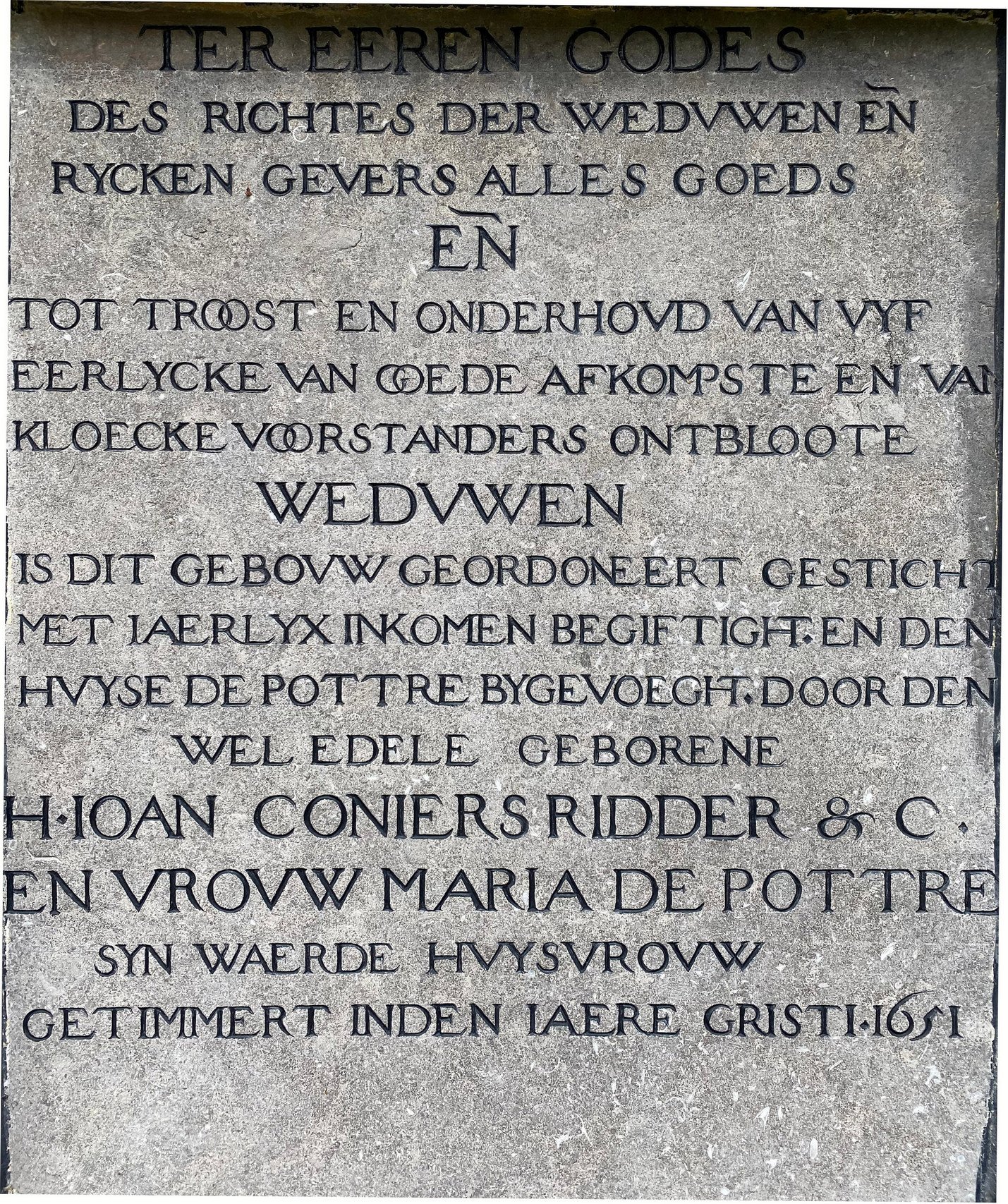
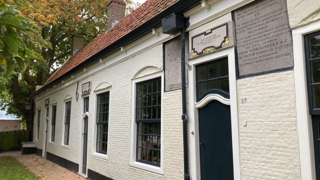
    These five widow's houses were named after the British Mr. John Conyers and his Dutch wife: the Conyers houses.

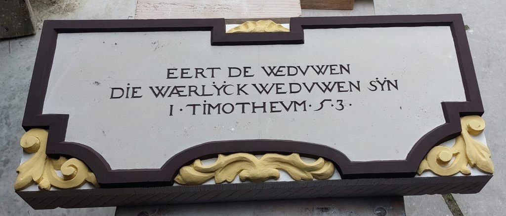
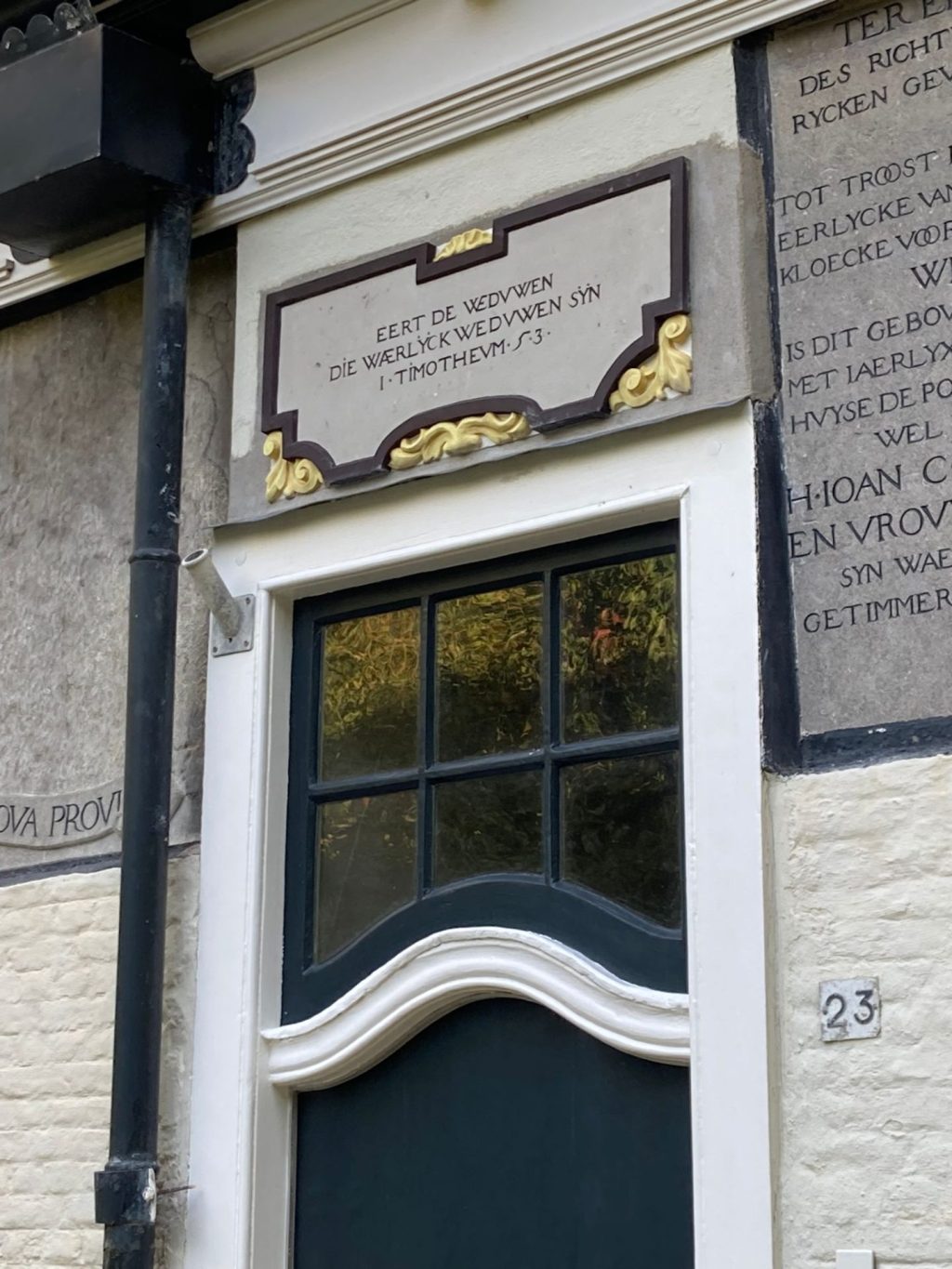
     A project that Jelle and I (in 2023 already, it seems like a very long time ago, but I'm way behind on blogging) worked on together were these five sandstone gable reliefs for five widows' houses in Noordgouwe.

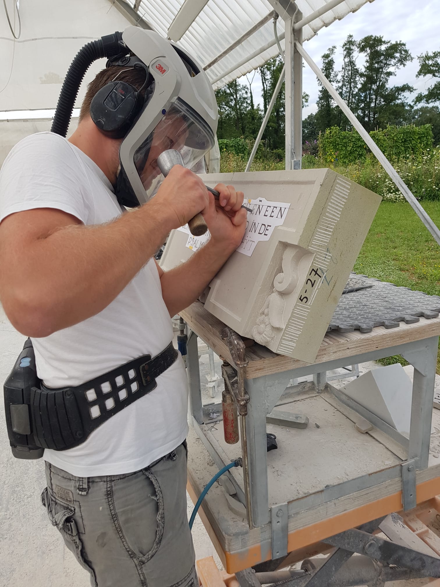
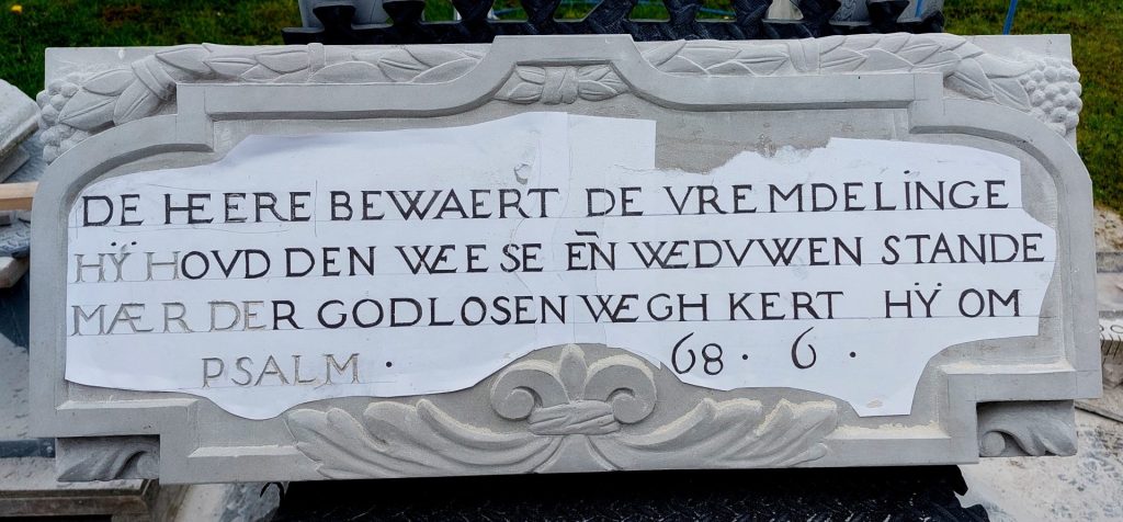
    Sculptor Koen van Velzen with facade stone in workshop

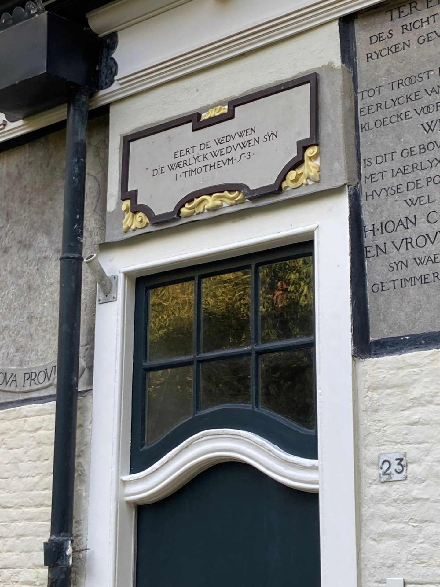
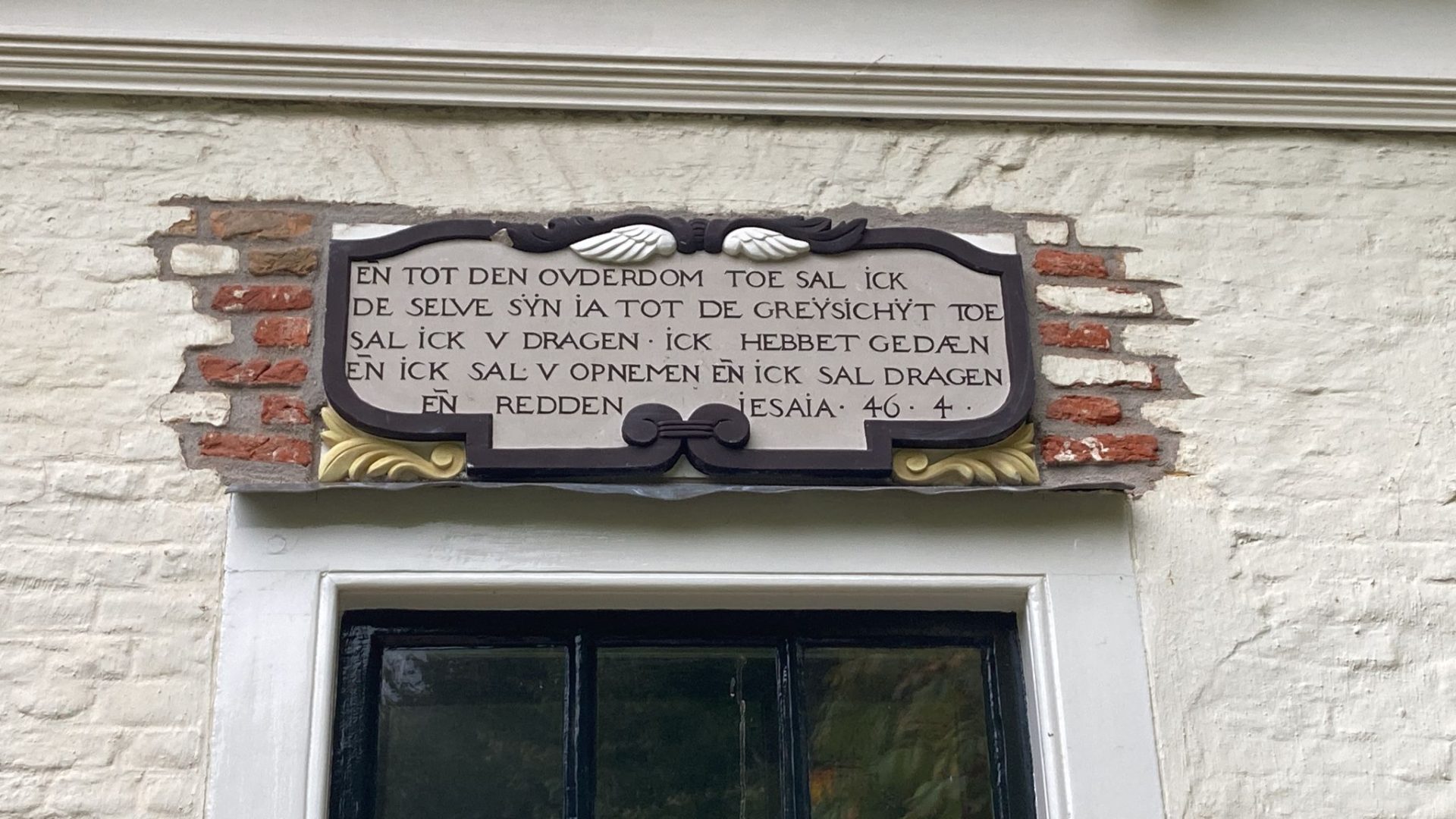
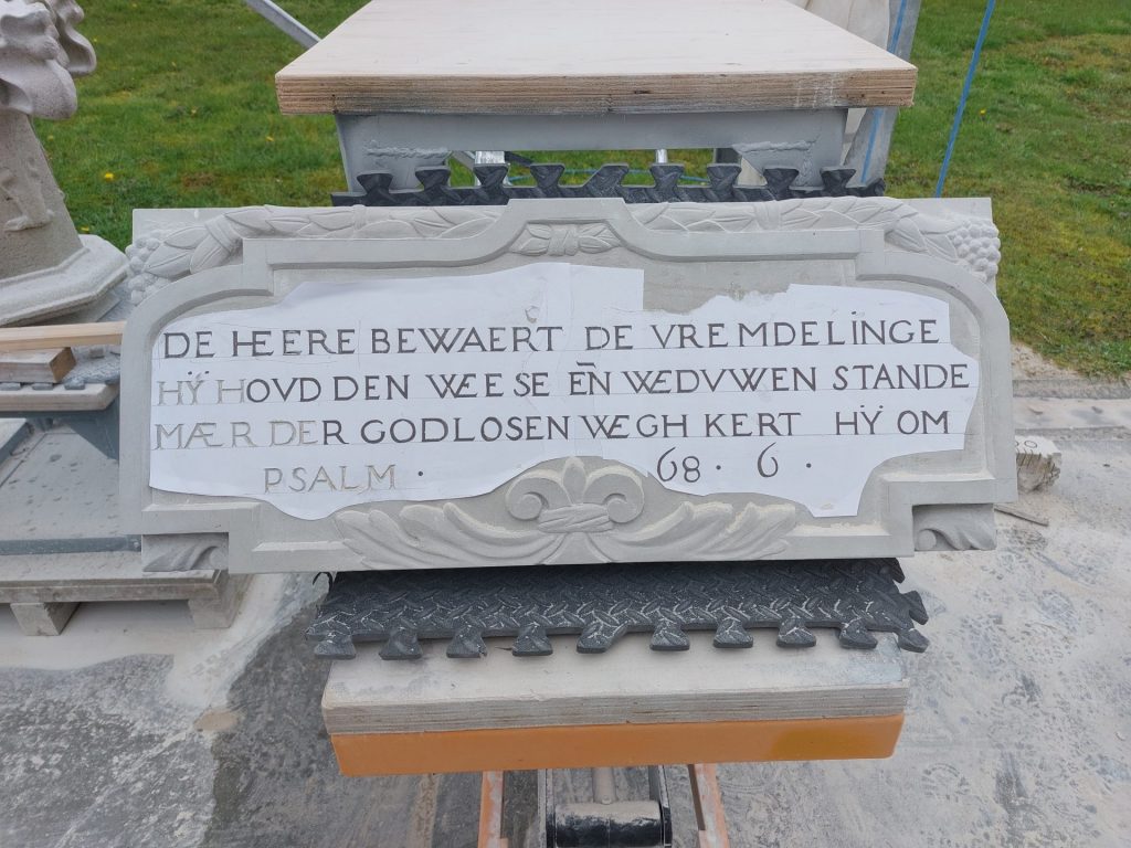
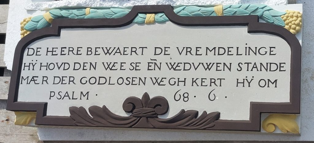
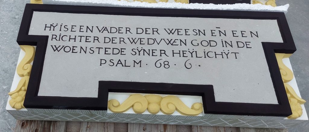
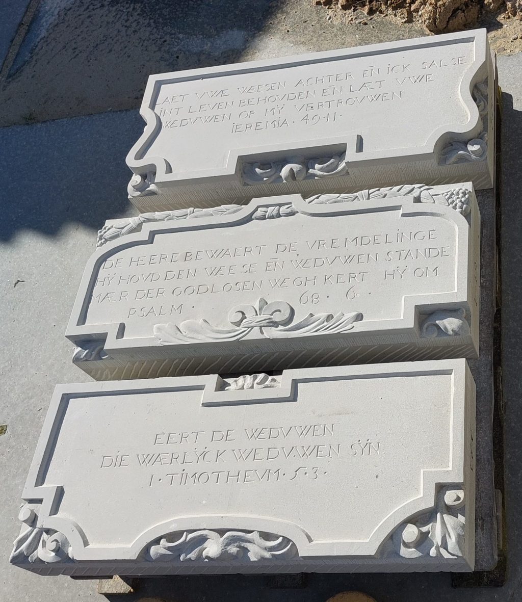
    These stones probably date from the construction period of the houses, the year 1651. These are five Biblical texts from one of the the oldest Dutch Bible translations from 1637, executed with some poetic freedom in terms of spelling and typography. For example, sometimes two letters have been combined into one, for example at WEESE and WEDVWEN, where the W and E are joined together, and at MAER where the A and E have been merged.

    Tracing and scanning

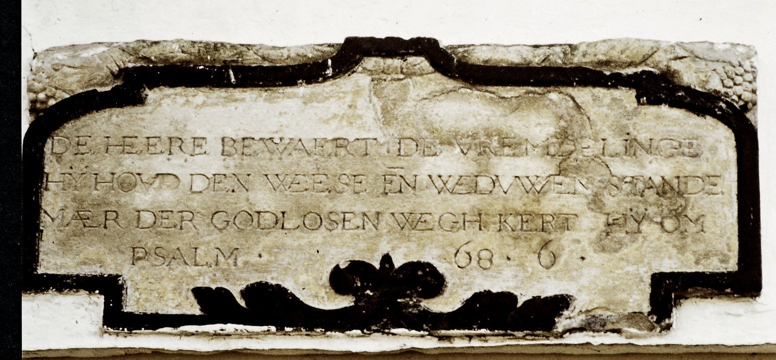
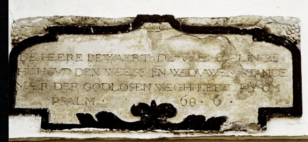
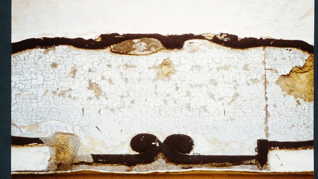
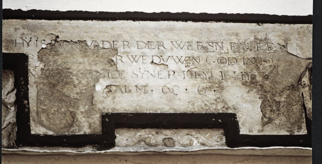
    Facade no 19: photo 1976

    The client, who currently lives in and manages these five houses, wanted to safeguard these gable stones for the future, by conserving the old stones inside and placing reconstructed copies in the five facades.

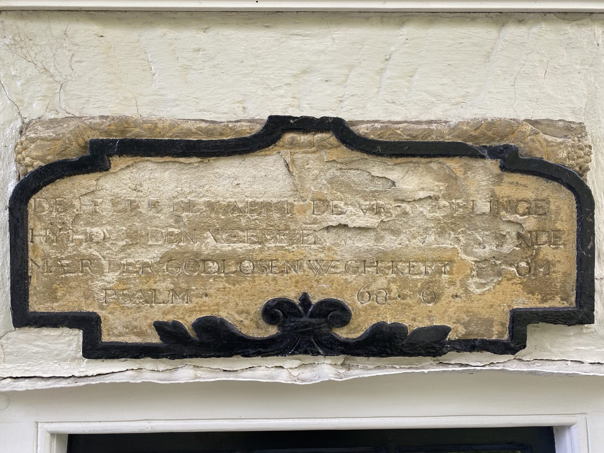
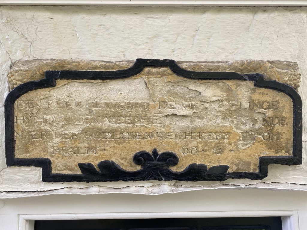
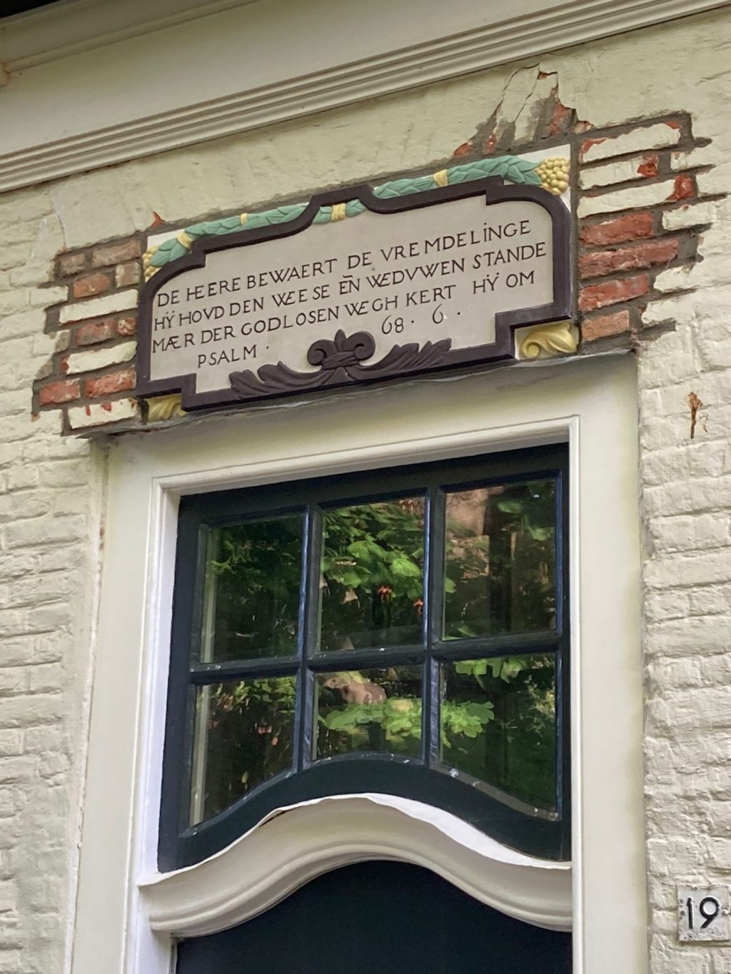
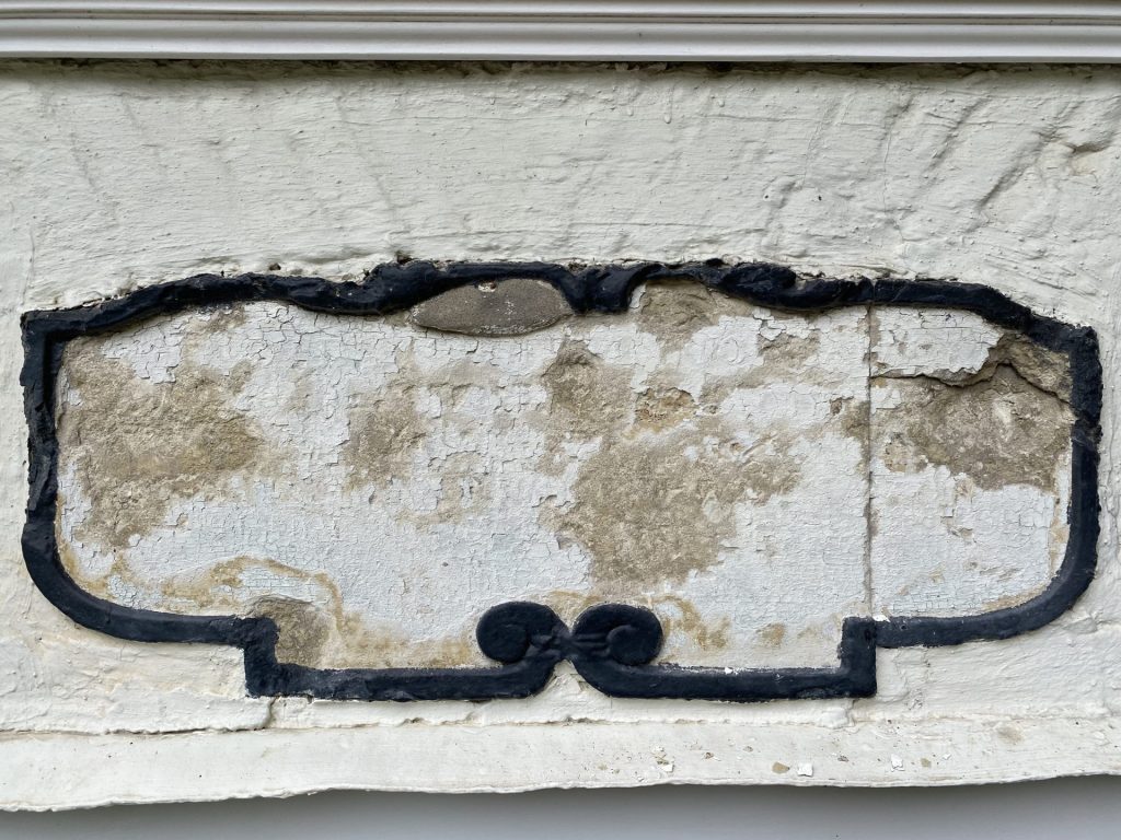
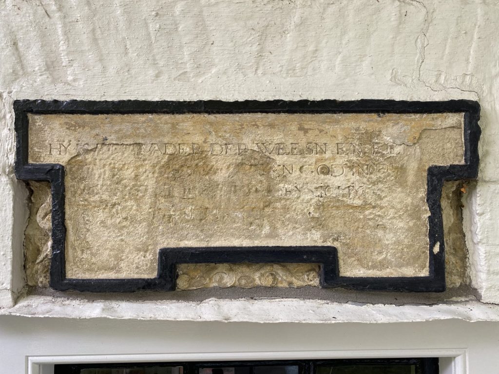
    facade no 19: photo 2023

    After much research, he managed to find all the original texts and asked us whether we could carve copies of these facade stones in new Obernkirchener sandstone.

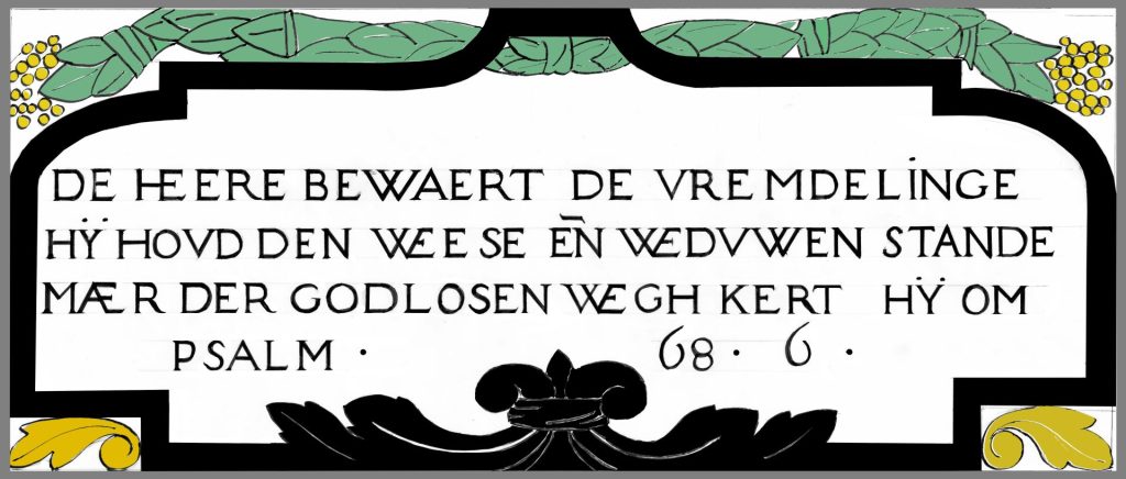
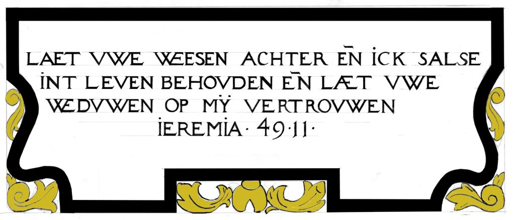
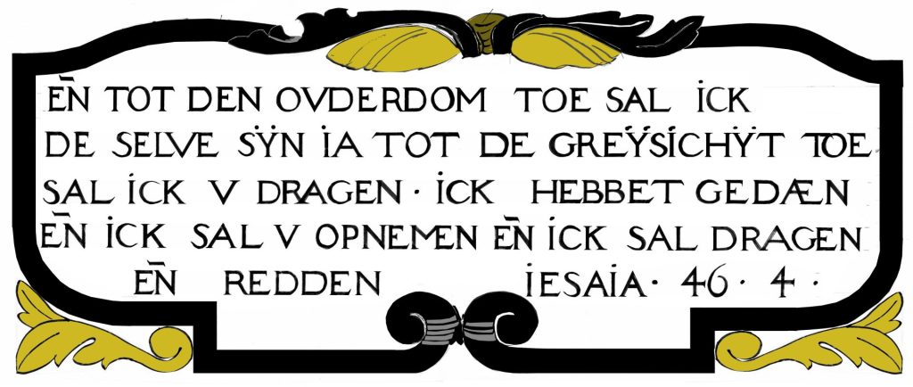
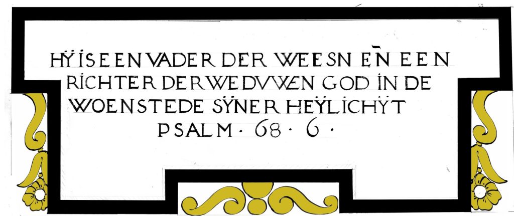
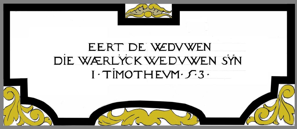
    1 of five facade stones, Noordgouwe: reconstruction drawing
    drawing based on photo and foil tracing

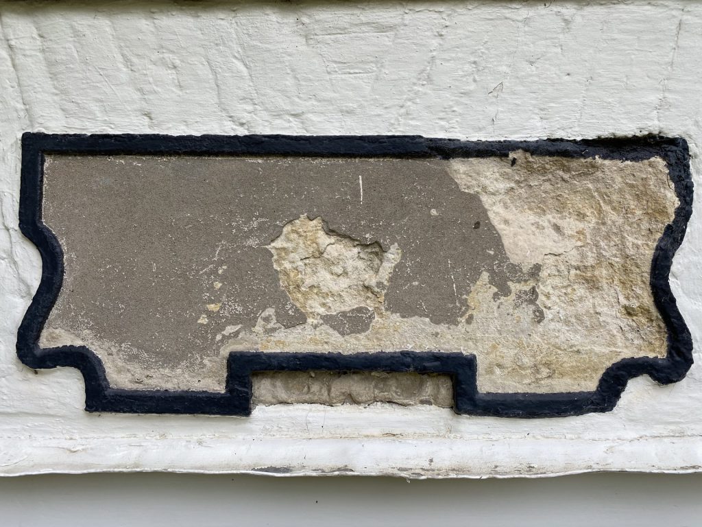
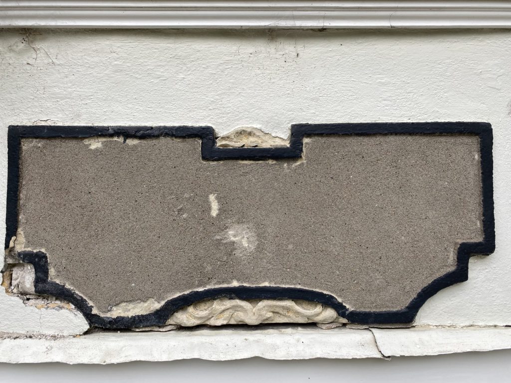
    We first measured the existing gable stones completely, I traced all dimensions out on transparent foil and took photos of the current condition. Unfortunately, the stones of facades no. 21, 23 and 25 didn't have any text anymore, as all this had been lost in previous centuries. However, the client managed to find the correct Bible texts.

    Strongly weathered

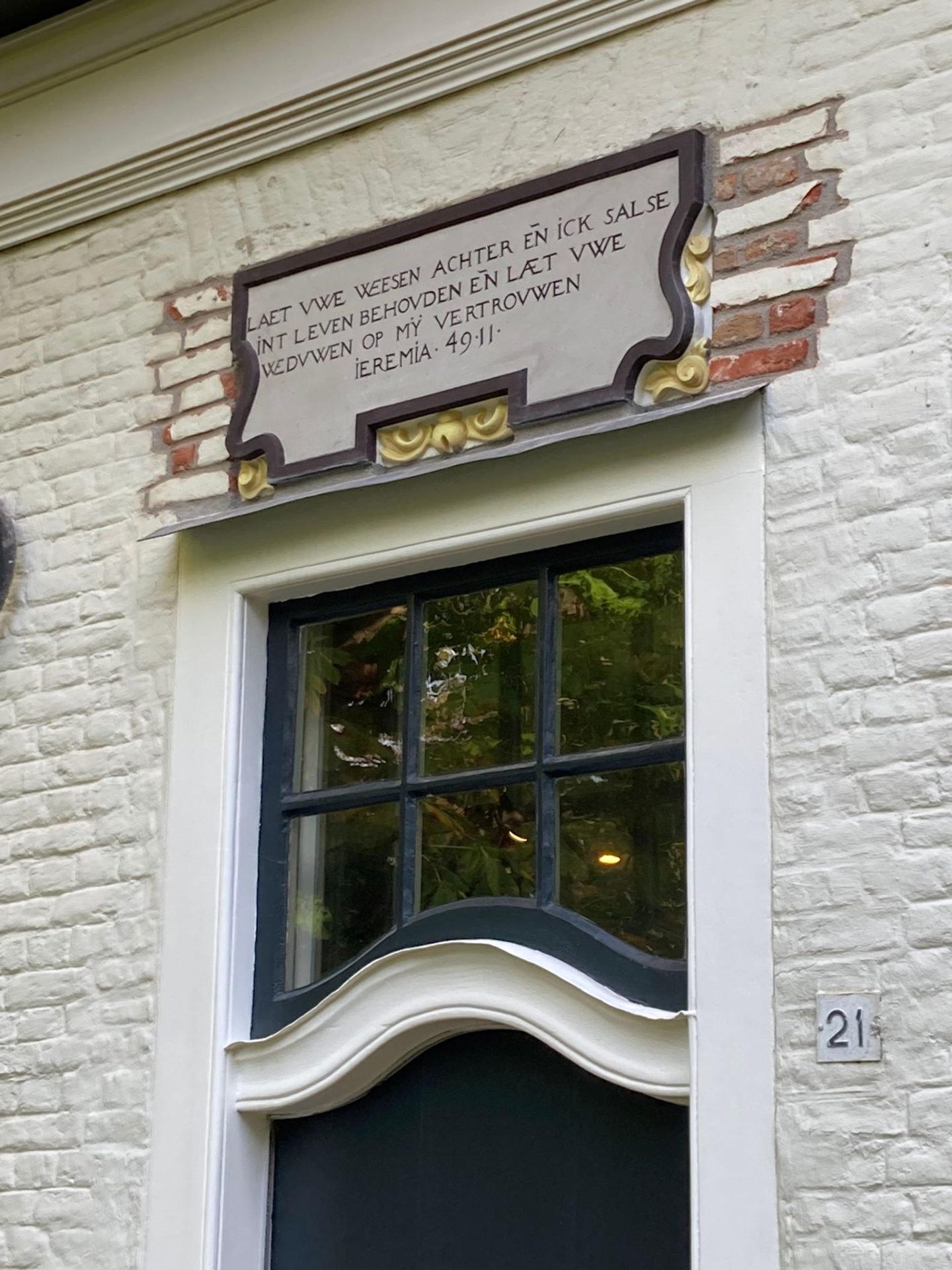
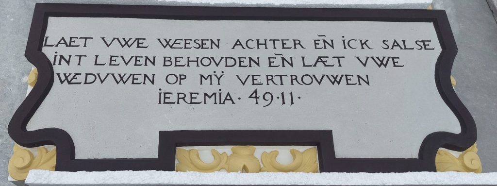
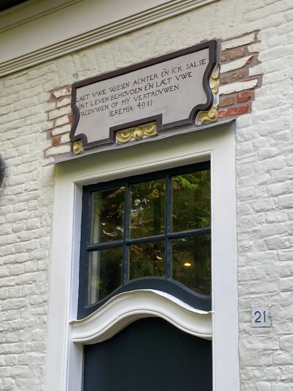
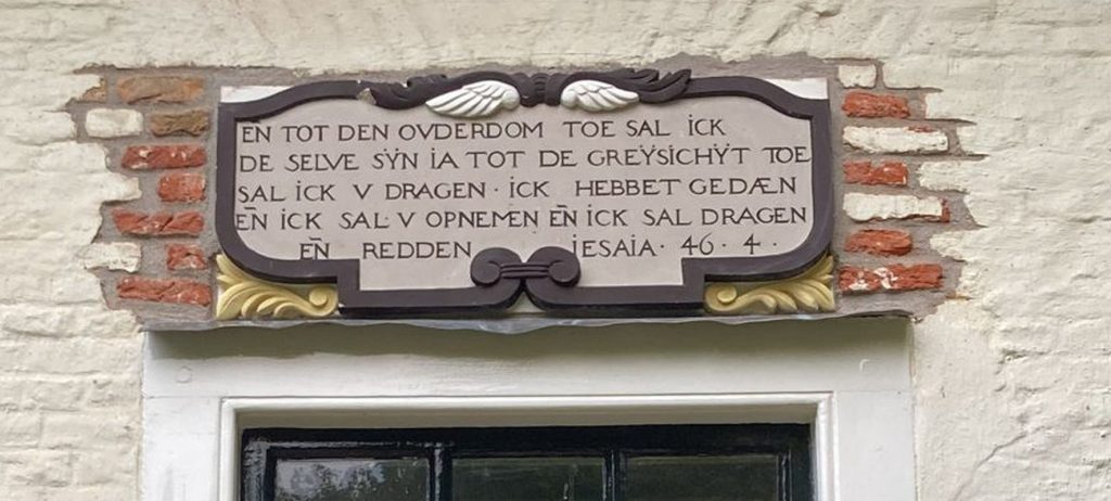
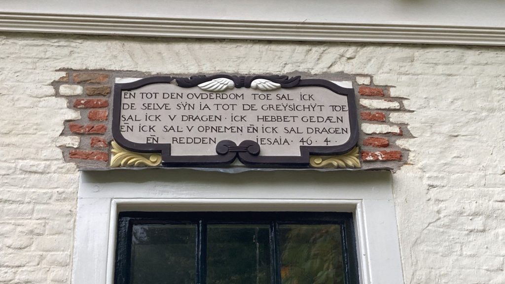
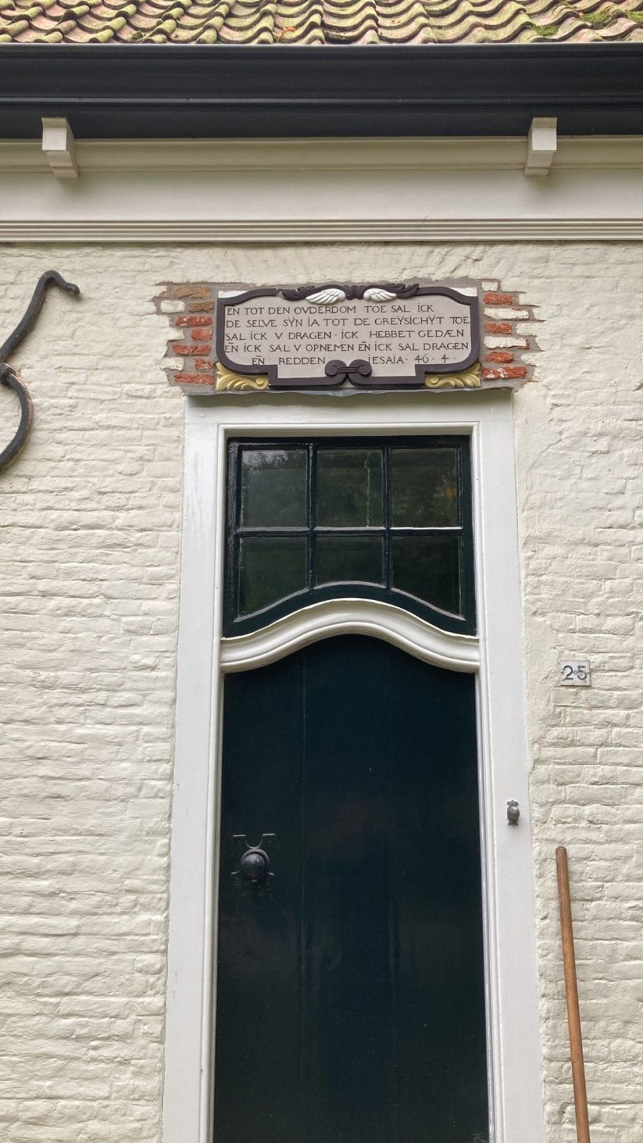
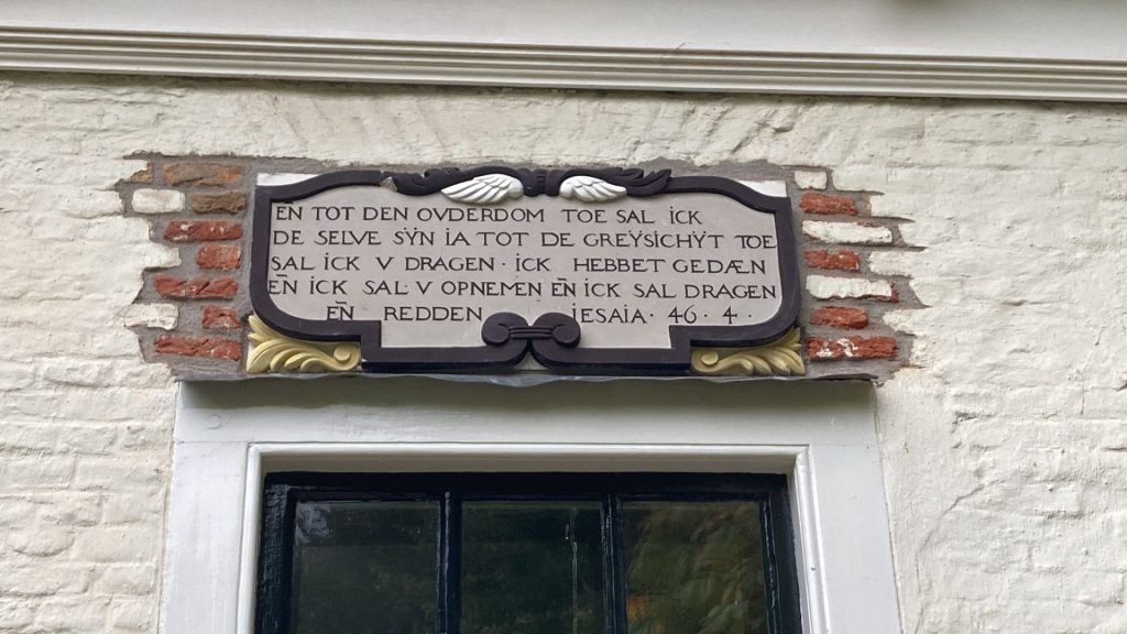
    1 of five facade stones for Noordgouwe: after installing
    gable stone no. 21

    Hence, only from two facade stones there were any visible texts left, and then only partially. In the photos from 1976 these two texts were much more complete and also easier to read.

    Thanks to all the research done by the client and a local historian, we were also able to reconstruct the text placement on the stone quite well.

    The ornaments were also only partially present; We had to supplement these with designs based on the existing remains.

    Devoid of brave proponents

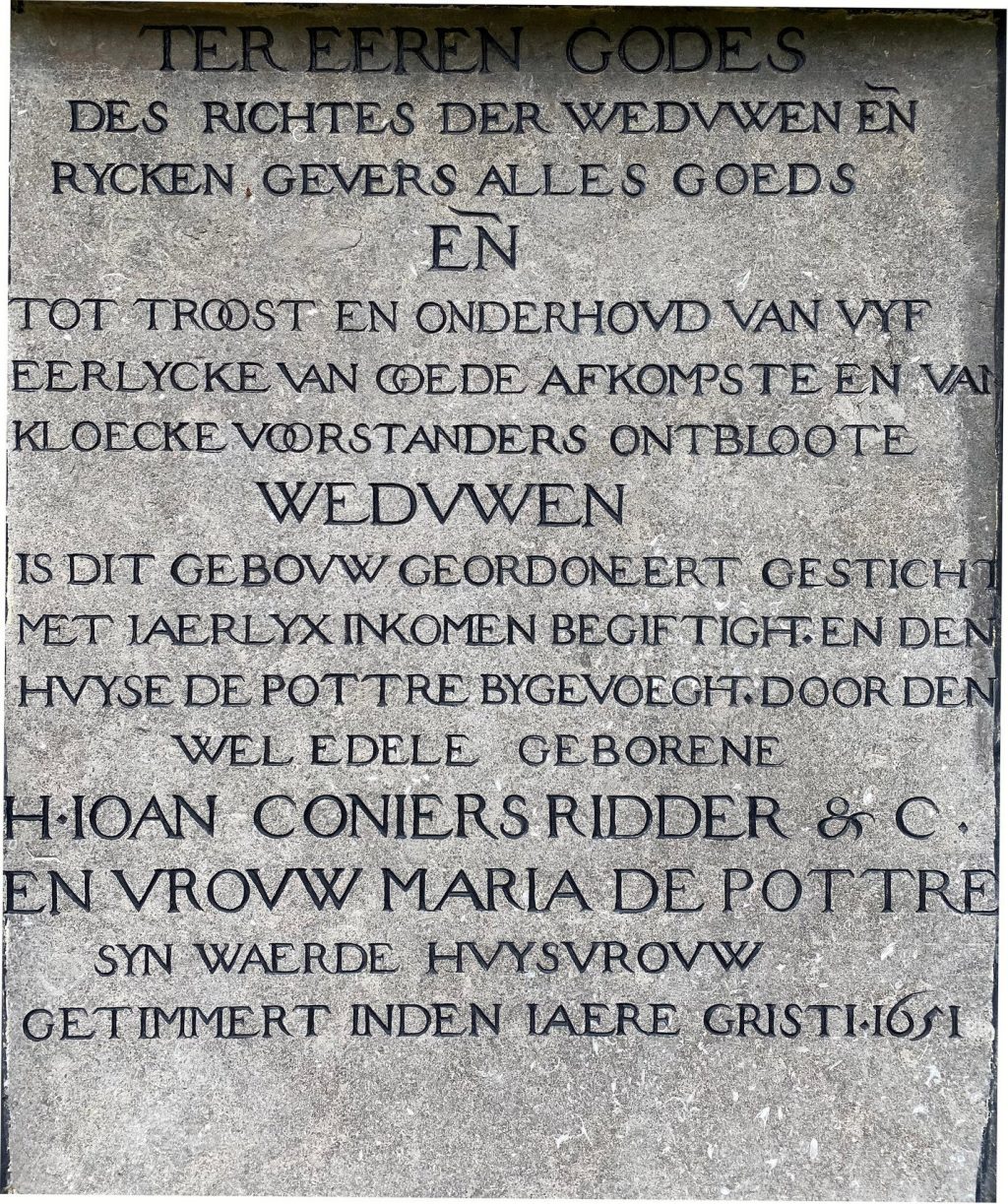
    For the letters, we were able to use a beautiful text plate next to the middle front door , on which all missing letters could be found, albeit in a slightly different style. It would appear that a different stonemason carved the letters on this plate than the person who made the gable stones. This text plate describes how these houses were built as a shelter for five widows who were 'devoid of brave proponents'’ -; i.e. women of good descent who no longer had anyone to care for them. In addition to the house, an annual allowance was also provided.

    Retain errors

    1 of five facade stones for Noordgouwe: after installing
    gable stone no. 23

    It is remarkable that there was an error in the old gable stones: both the first and last text are referred to as PSALM 68:6, while the text of the first facade is actually psalm 146:9 ... In consultation with the customer, we didn't correct this peculiarity, because it forms part of the story of the vicar , the client and the stonemason who executed it. Perhaps the different spelling is also because someone passed it on orally in one of these steps?

    Different order

    1 of five facade stones for Noordgouwe: after installing
    gable stone no. 25

    Normally in such a project all the parts are removed first, then they are somewhat repaired and reconstructed, then the stone is ordered and the copies are carved, and finally the copies are placed back into the facade. That was not the most convenient approach in this case, because in that case the client would be left with five large holes in the facade for six months. There were also concerns about the support for the roof and surrounding masonry.

    1 of five facade stones for Noordgouwe: completed
    gable stone no. 27

    That's why I suggested measuring it all beforehand, and reduce costs by ensuring that the contractor could remove 1 stone and immediately put its replacement back in. That would save a lot of work, including setting up scaffolding one less time, and the house would not be open to the elements for six months. There was still some uncertainty about the precise thickness of the stones, but the customer drilled a hole through the masonry and was thus able to make a good estimate of the desired thickness and the space in the cavity. This allowed us to order the new Obernkirchener sandstone.

    Reconstruction

    1 of five facade stones for Noordgouwe: transferred onto foil

    Due to the brittle condition of the old gable stones, it was decided to leave them in the facade as long as possible. There was a good chance that a lot of damage would happen to the stones when they would be removed, causing loss of information. The gable stones were measured and the available information was traced using transparent foil (markings, ornamentation and, if possible, parts of texts).

    1 of five facade stones for Noordgouwe: match photo and foil

    I scanned these foils into the computer and matched the images in Photoshop with old images of the gable stones, so that the text overlaps exactly with the foil stencil. This way, the perspective distortion of the photo has been removed. See an example of this matching below, namely from gable stone no. 1-19. The black marker lines on the foil are projected over the photo. After this, the ornaments and edges of the facade stones were reconstructed by hand using tracing paper and then drawn out in full size.. The same thing happened with the texts.

    1 of five facade stones for Noordgouwe: reconstruction drawing

    There were still some clear photos dating from 1976 showing the texts on the stones 1 and 5, with which many of the missing letters and the style of the letters could be easily reconstructed.

    Execution

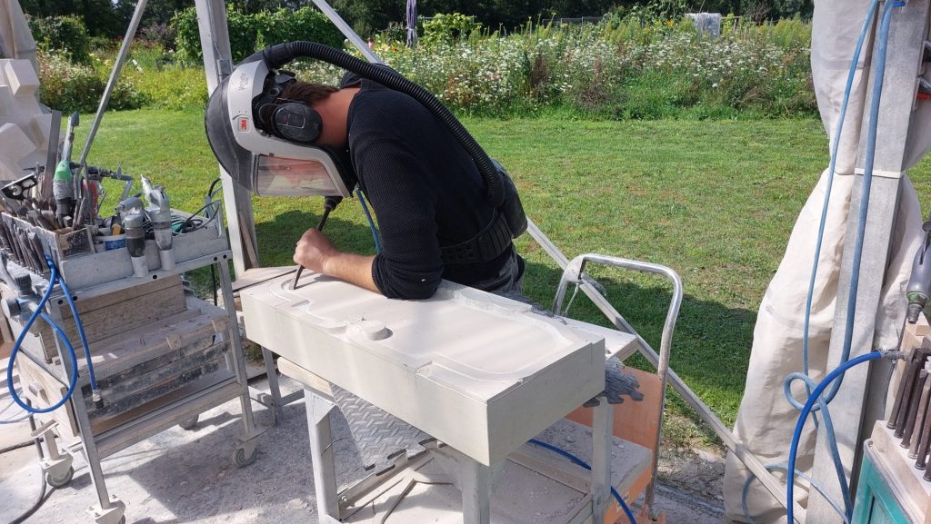
    1 of five facade stones for Noordgouwe: Jelle carving the letters
    Jelle carving the letters

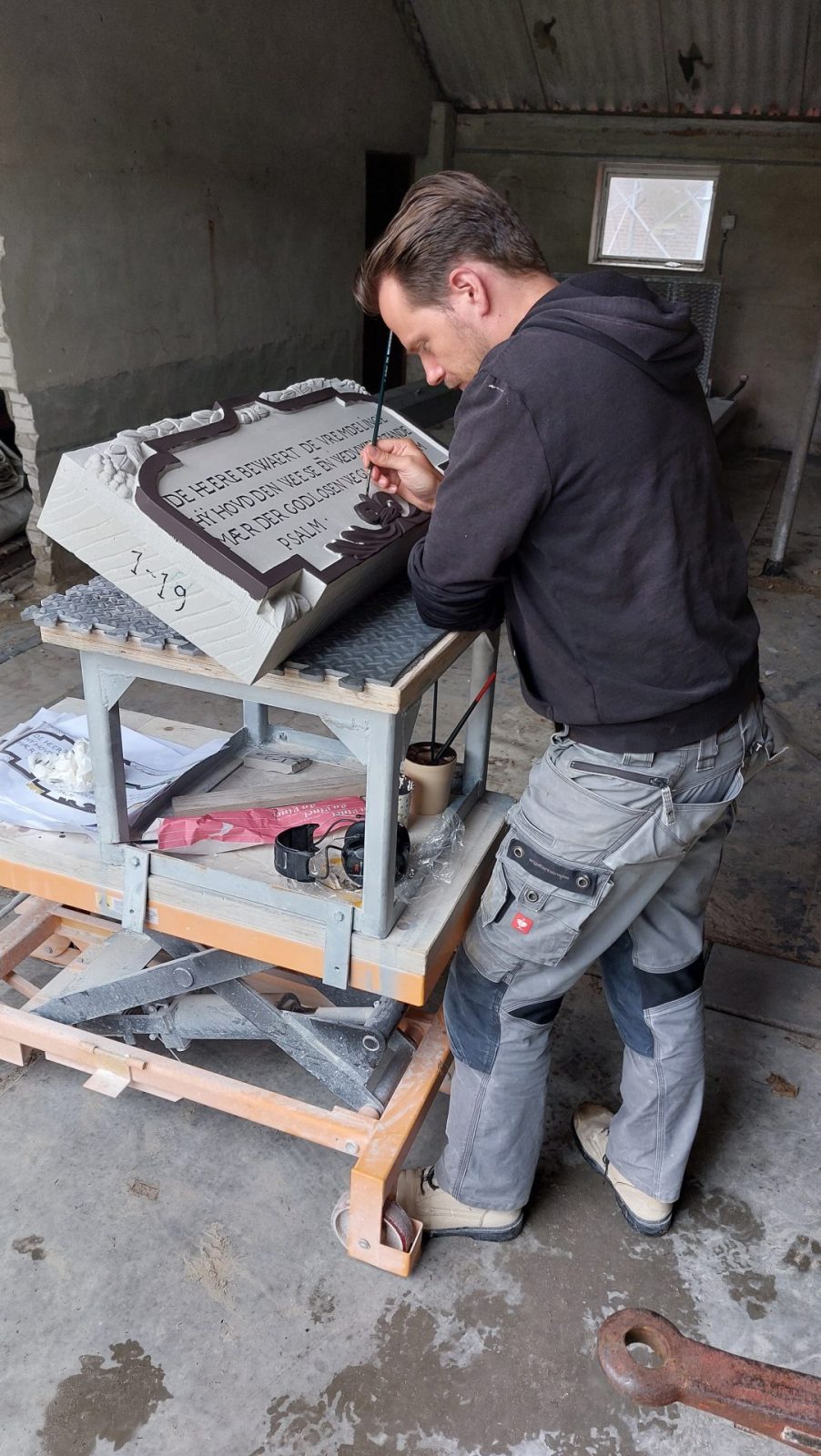
    Based on the colored designs, we first carved the cartouches, after which Jelle carved the letters, because he has the most experience with that. This time he also took care of the polychromy. The new reliefs were then transported and a local contractor removed the old gable stones, the new stones were placed and the surrounding brick was repaired. The customer still had to color the bare bricks in the photos.

    Gallery: before, during and after

    Conclusion

    There is much more to tell about the background of these houses, the biblical texts, the findings of the historians, the client's quest, the typography and the material used at the time. There is also quite a bit of background material in PDF with more information about all these matters, but I think this gives enough of an overview of this commission, which we enjoyed working on again.

  • Veghel 2: Forty enamelled panels

    Unique project in Veghel-2

    Forty enamelled panels

    As I mentioned in the previous post about our work on the Lambertus Church in Veghel last time, for this project we also filled ten niches with enamelled panels. It is especially these panels that were a challenge for us. It's unique in the Netherlands that this method was used at this time and we have had to reinvent the wheel for many aspects of this technology, because to my knowledge this hasn't been done before.
    These ten panel parts were subdivided into four pieces each, and as such, from top to bottom:

    • a triangular spandrel with a plant motif and a heraldic rose.
    • a scene from the life of Jesus
    • a narrow text strip
    • a bottom panel with a geometric pattern of circles and intersecting lines

    Everything in natural stone

    Finials for the arches at the church of Veghel
    roofs of the arcatures

    The entire facade has been reconstructed in new stone, delivered by Slotboom Steenhouwers BV from Winterswijk. They took care of the bluestone plinth and all the pieces of yellow Jaumont limestone, on which we designed the ornaments (see the previous post). They also supplied the stone for the enamelled panels: French Volvic basalt lava. We received it neatly cut to size in sheets of 5 cms thick. Basalt lava is an magmatic rock, that is, it once flowed liquid from a volcano. This type comes from around the village of Volvic in the French Auvergne region, near Clermont-Ferrand, where the whole cathedral was built out of this stone.

    completed crocets in Volvic basaltic lava, wet by rain
    Volvic basalt lava is also beautiful when wet

    Perhaps you'll know of the black hexagonal blocks that are used everywhere in the Dutch dikes: that's basalt too. The material is virtually indestructible but also almost impossible to carve. Rock hard stuff.

    Fortunately, basalt lava is a lot easier to carve, because it is completely porous from tens of thousands of tiny gas bubbles that came along with the lava flow at the time.

    It's also less black, and especially Volvic is quite even gray. Yet it also has its own color schemes, which are especially visible when the material is wet: from anthracite to dark brown and even purple brown. We've worked in it before, such as last year when we made a batch of large crockets for the Dom Church in Utrecht. Other varieties are Mendiger and Mayener basalt lava from Germany, which are much darker and above all much coarser and harder.

    Sample panels

    To see how the carving and enamelling would go, Jelle and I first made two test pieces for these enamelled panels: a panel with a part of Jesus on it, plus a piece of text. We carved out the image and the letters and sent them to the French enameller for a test piece. However, the first result was not quite to my liking. My own work had to be sharper and the enamel work could also be better. After a lot of consultation about what our goal was, we then started with the first triangular panels at the top, the so-called spandrels (a spandrel is an area at the top between the lines of a pointed arch).

    Spandrels

    I had already noticed during my research at home that there were three motifs in these panels: the middle spandrel had an ivy motif which I named 'C'’ and the other four had alternately a kind of thistle- and a leaf motif (ā€˜A’ and 'B'). These were placed nicely mirrored on the right facade, (A-B-C-B-A) but left was an irregular rhythm (A-B-C-A-B). I decided to keep the reflection the same on both facades, so that there was a clear regularity.

    I'd sharpened and enlarged the old photos of the two facades again and had everything printed out to full size, so we didn't have to enlarge this by hand. I had also reconstructed the curves of the spandrels and the trefoils at home, in this case with Sketchup. Because I don't know AutoCad, but with Sketchup it worked fine. We could use these prints to transfer the image onto the stone.

    Nico carving a finial

    Jelle had made the first spandrel, but there was so much work to do we thought we wouldn't get it all done in time. Fortunately Nico came in January to make these spandrels, so that Jelle could continue with the first capitals. When it started snowing in February, we were able to get a first impression of the result in basalt lava.

    Jelle working on the first capitals, February 2021

    The texts

    I had also been staring at the texts for a while and I had scoured the internet for an Old Dutch font that closely approximated the old letters.. I knew it would never quite work out because the letters were originally just a hodgepodge of hand-cut letters in stucco, with modern fantasy capitals and gothic-looking lowercase letters.

    part of the reconstruction by Britt Nelemans
    part of the reconstruction by Britt Nelemans

    The spacing varied greatly and also there were two different versions of the S. Of the Dutch letter combination ij there was a version with dots on the i and the j and one without, which could sometimes even be found together in one sentence. The lower case a was replaced by a small capital A. But I was hoping I could match the text in Photoshop with the super-blurred old photos, on which I could only discover some smudges and stains. Maybe the whitespace could reveal how the words were originally placed. That worked, but it only gave an idea of ​​how it should be. The real letters were to be hand drawn.

    Letters In Steen

    I soon realized that this was a time-consuming part and that Jelle and I simply couldn't do everything ourselves. Jelle had carved the test piece for this long before, based on a computer font, but the final text would be manual work. But Jelle was already busy carving twelve capitals and had his hands full with it. That's why I was happy to outsource this part to Britt Nelemans, who has her studio Letters in Steen in Utrecht. Britt specializes in carving text in stone and was therefore the perfect person to reconstruct and carve the old lettering. She did that with all due care and feeling, even though this type of stone is not very suitable for the really fine lines of those Gothic letters. It got tense for a while when she broke her wrist… but everything was delivered on time for transport to the enameller!
    The bottom panels

    Arcatures Lambertus Church
    old condition on photo before 1960

    The ten enamelled panels at the bottom were a next big job. Because those had to be very clean lines, we thought we would be smart and outsource this work to have it sandblasted. I had first looked at the bottom panels extensively using drawing programs. I manged to make a reconstruction of them, which has been converted into a CAD drawing by Slotboom's designer.

    my reconstruction in Sketchup

    That drawing was then used as a starting point for the computer plotter that would cut out the sandblasting rubber. The motif consists of a series of perpendicular lines in an oblique pattern, with a circle motif with petals at the intersections of the lines. Alternately, the circles have an open and a closed heart.

    So this was eventually sandblasted into the stone by Bas Mulder from Slotboom Steenhouwers, but it did have quite a few hickups.

    the first enamel layer has been applied

    The blasting foil did not stick well on this coarse stone, and because at first I had said that it needed to be up to 7 mm deep it was also very difficult to get the desired result. I don't know how he did it, but in the end he succeeded.

    Ten scenes from the life of Jesus

    Jelle is working on The Descent into Hell

    Now it was already quite a task to reconstruct all the other parts, but doable. We saved the hardest for last, so that we now had a good grasp of the material and design. From four of these panels with the big scenes (nearly 110 x 90 cms wide) there were some clear pictures. Jelle and I were able to copy these photos into the stone without much alteration. But the other six were a lot less sharp and a few were so indistinct that even after magnifying all that remained was just a few blurry spots .. The solution was of course drawing them anew. We first printed them all a few times on A4 format and drew the desired lines on it, and repeated this so many times that we began to know the scene and the lines, in a combination of interpreting and tracing.

    Once by our drawing practice we had arrived at a good reconstruction, we started on the full size drawings. We were able to transfer these onto the basalt lava plates and then carve them into the stone. The surfaces were all deepened and the lines, just like with hand-carved letters, were carved into the stone in a V-shape. In this way we hoped to approximate the effect of the stucco and also to provide the enameller with a clear indication of the lines.

    But in this gray stone it's hard to imagine what it should look like. Only with hard light from the side could a glimpse be caught and would the lines become clear. We were hoping it would be a lot clearer in enamel.

    Enamelling

    After everything was ready and approved, we strapped them onto a few pallets and all parts were sent off to France for enamelling. We ourselves continued to carve the ornamental parts of the Lambertus Church and making the two limestone statues of St. Peter and Paul.

    Meanwhile, in the studio in the Auvergne, they worked hard to get everything ready on time and every line was painted with care.. After the primer, the cream-colored base color follows, then the orange-red color of the backgrounds, and finally the brown color of the lines, each time with a round in the oven at 960 degrees Celsius. The enamel melts at this temperature, and the stone can also crack if the tensions are too great, so professional knowledge and great care is a first requirement. Normally enamelled panels are 2 or 3 cms thick, but because of their application and the transport, we went for a thickness of 5 cms wide, which resulted in an extra level of difficulty.

    The completed panels

    In September, the new enamelled panels arrived at the stonemasonry in Winterswijk. There they were first displayed on the floor for a final check, before they were installed. The panels were anchored to the church with stainless steel anchors in the wall behind and then grouted all around. If you zoom in well on the photo, then you can see that I had given all forty panels the number of the construction drawing and also their own serial number from 1-10 for our own use and for the installers from Slotboom Stonemasons. Because crayon will burn off at 960 degrees in the enamel oven, I carved the numbers into the sides.

    Five times sad

    Here we see successively five sad and five joyful moments from the life of Jesus. It starts on the left, with the Dedication in the temple, where Joseph and Mary are told by a scribe that their child is facing a great but hard life.

    On plate 2 Joseph and Mary flee to Egypt with their child Jesus, because King Herod has decreed all the little boys under 2 years old in Bethlehem are to be killed. He doesn't want competition from a new 'king of the Jews'.

    In the third scene we see how Joseph and Mary return to Jerusalem after three days of searching, where they find the twelve-year-old Jesus in consultation with the scribes. At that time he already shows his great wisdom.

    Mary's fourth sorrow is the Descent from the cross. Mary sits with the dead Jesus on her lap, and Mary Magdalene and John kneel beside her.

    In the fifth image, the body of Jesus is placed in the tomb.

    Five times joy

    To the right of the church are the more joyful moments from Jesus’ life. This group must be read from the outside in, just like the left panels, in this case from right to left. So on panel 10 we see how the three wise or kings from the East offer their gifts to the child in which they recognize a great soul.

    On panel 9, the second from the right, Jesus is baptized in the Jordan by John the Baptist. John stands in a robe of camel hair (itchy) and an angel descends to the left, while the holy spirit descends like a dove from above.

    On the center panel, number 8, we see how Jesus undergoes a transfiguration on Mount Tabor and how Elijah appears on the left and Moses on the right. The sculptor makes the three seemingly float in the air above a convex mountain top.

    On plate 7, the fourth from the right, Jesus descends to hell and frees Adam and Eve from original sin. The devil at his feet is trampled and the dungeon door is wide open. There is room for columns and capitals in hell.

    On the last plate, number 6, we see the resurrection of Jesus depicted. Two Roman soldiers turn away in terror and blindness as Jesus beams and rises from the tomb with a staff.

    Design from another time

    If you take the original photos, you do notice that the new reliefs radiate less of the dreamy atmosphere that the old work had. This is mainly because it concerns a fundamentally different process. Matt stucco simply produces a different surface than glossy enamel, and where it was possible to show something of gray tones in the stucco version, with the current version it's either black, or white. The image has been converted to a line drawing. Another cause is the color scheme: the old work had yellowed a little more over the years, making the current cream (the photos show the panels much whiter than they actually are) a bit harder. After all, a lot of sharpness has been lost in the old work over the years, and also the old photos are pretty blurry, so that the new work must come across very sharp. It will probably take some getting used to for the Veghel people, but for me it's a chance to retell the stories from Jesus’ life, seeing those through the eyes of another time as well. Panta Rhei, as the Greeks already said: Everything Flows, everything changes.

    To the first post about this project.

No more messages to show.

No more messages to show.